student employment hiring process: redesign
“The following project focused on the hiring process in the Student Employment department at Minneapolis Community & Technical College. The department needed an upgrade to their current hiring process. The goal is to simplify the process for users so that students can be hired quicker and more efficiently.”

Let's start with...user research
Who are the users? What are their goals + needs?
I used survey monkey to reach out to coordinators and supervisors to gain some insight on the current hiring process.

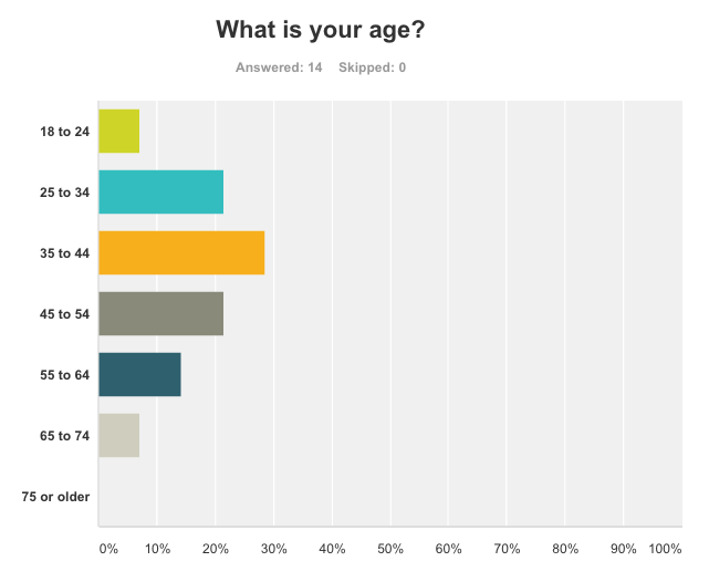
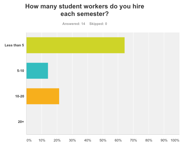

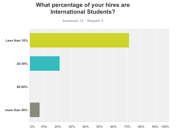


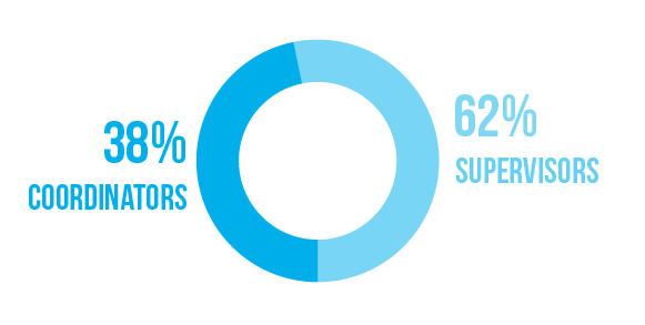
survey results


user goals
"to quickly get to a site where i can see the status of hiring requests and i can quickly ask for additional funds"
" to complete required paperwork (i.e. hiring requests, authorization increase requests, etc). tracking said paperwork"
" to hire new students, view handbooks, tips, tricks, news of the day"
the gist:
a faster, more efficient way to hire student employees
an easy to navigate site that doesn't send the user on a treasure hunt
a better understanding of the student employment program
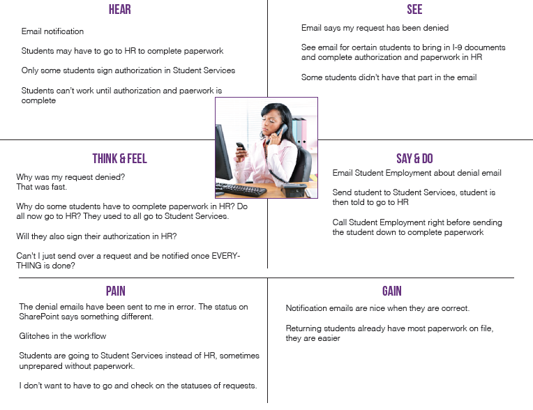
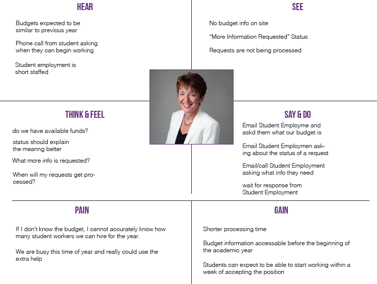
personas + empathy maps


hueristic analysis
The current hiring process is housed on SharePoint, so I compared it to a couple of other hiring platforms out there!
Throughout the Heuristic Evaluation of SharePoint, Jobvite, and Recruiterbox, I found that SharePoint, as a hiring platform, is lacking in many aspects. SharePoint currently has no engagement in resume submission and filtering--before the hiring process even begins!
However, when managed correctly, its a great data storage tool. SharePoint has features like “views” that allow the user to customize to what information they want visible to them based on criteria set by the user. However, creating those views aren't the easiest things to understand for beginner users.
Most of the workflow would need to be organized and structured in a way that internal employees can screen candidates while maintaining a certain level of confidentiality. Supervisors should be able to view/access also allowing info such as status, award, budget, etc.
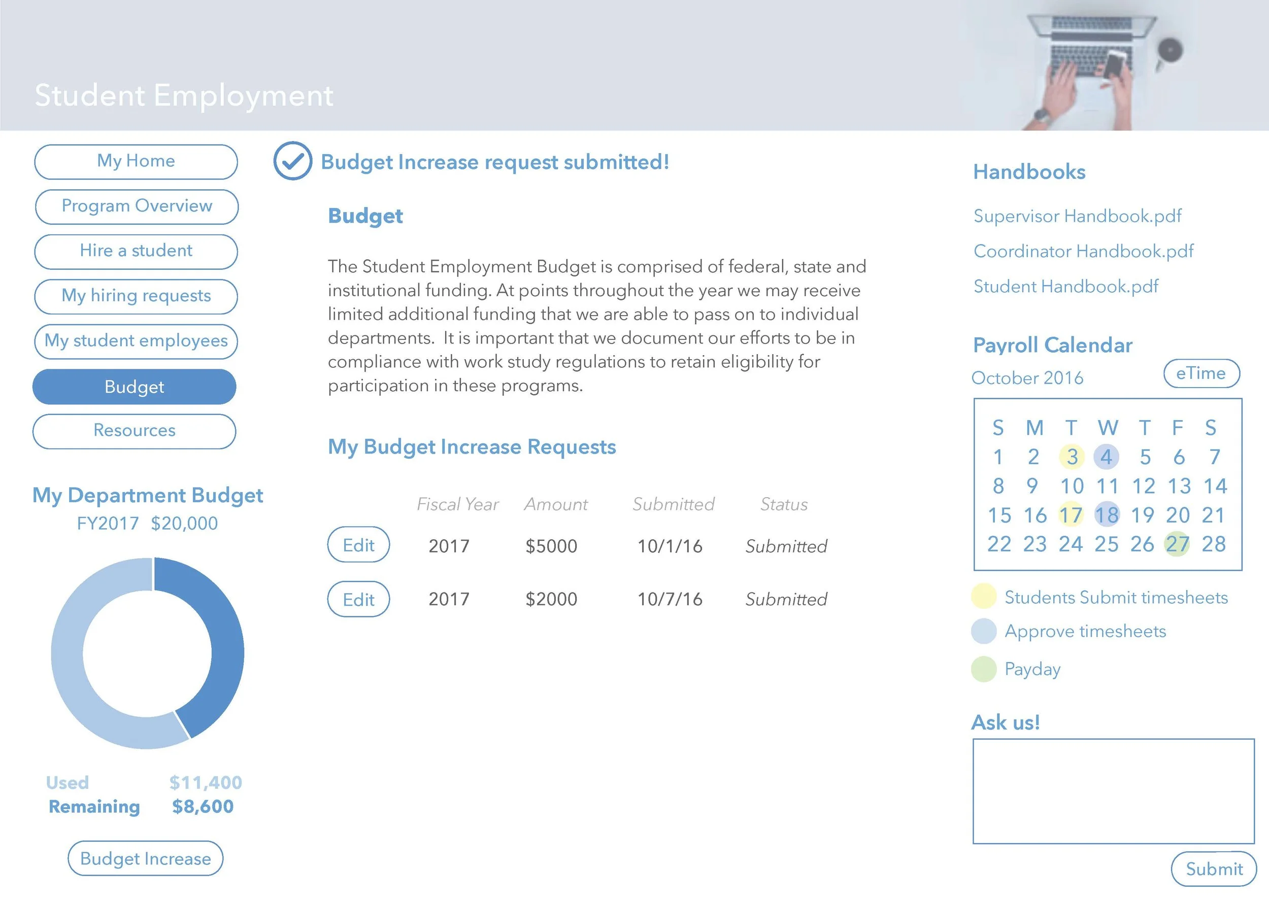
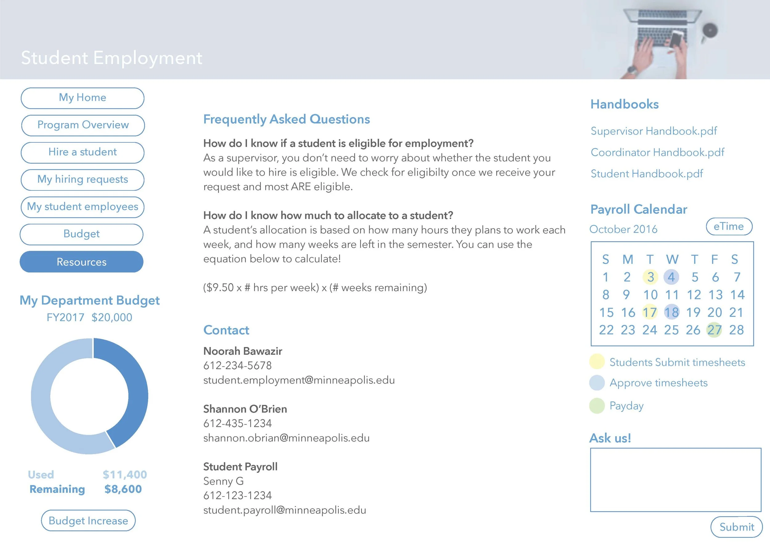
content strategy
I used Optimal Workshop for a card sort. because there are over 50 supervisors and coordinators, I wanted to reach out to as many as possible, so I saw the online card sort as the best approach. These results are reflective of individuals who completed the entire card sort, consisting of 30 cards.
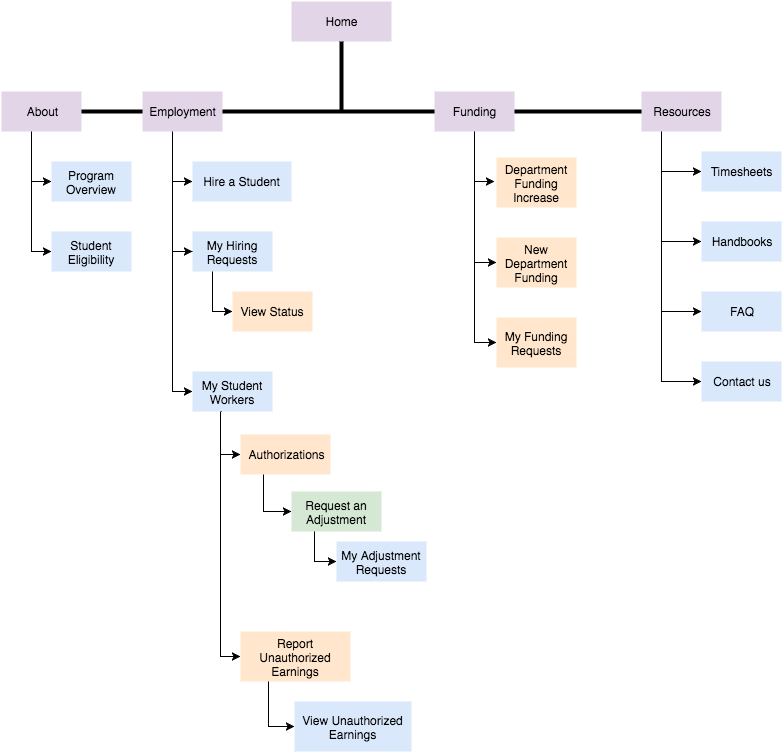
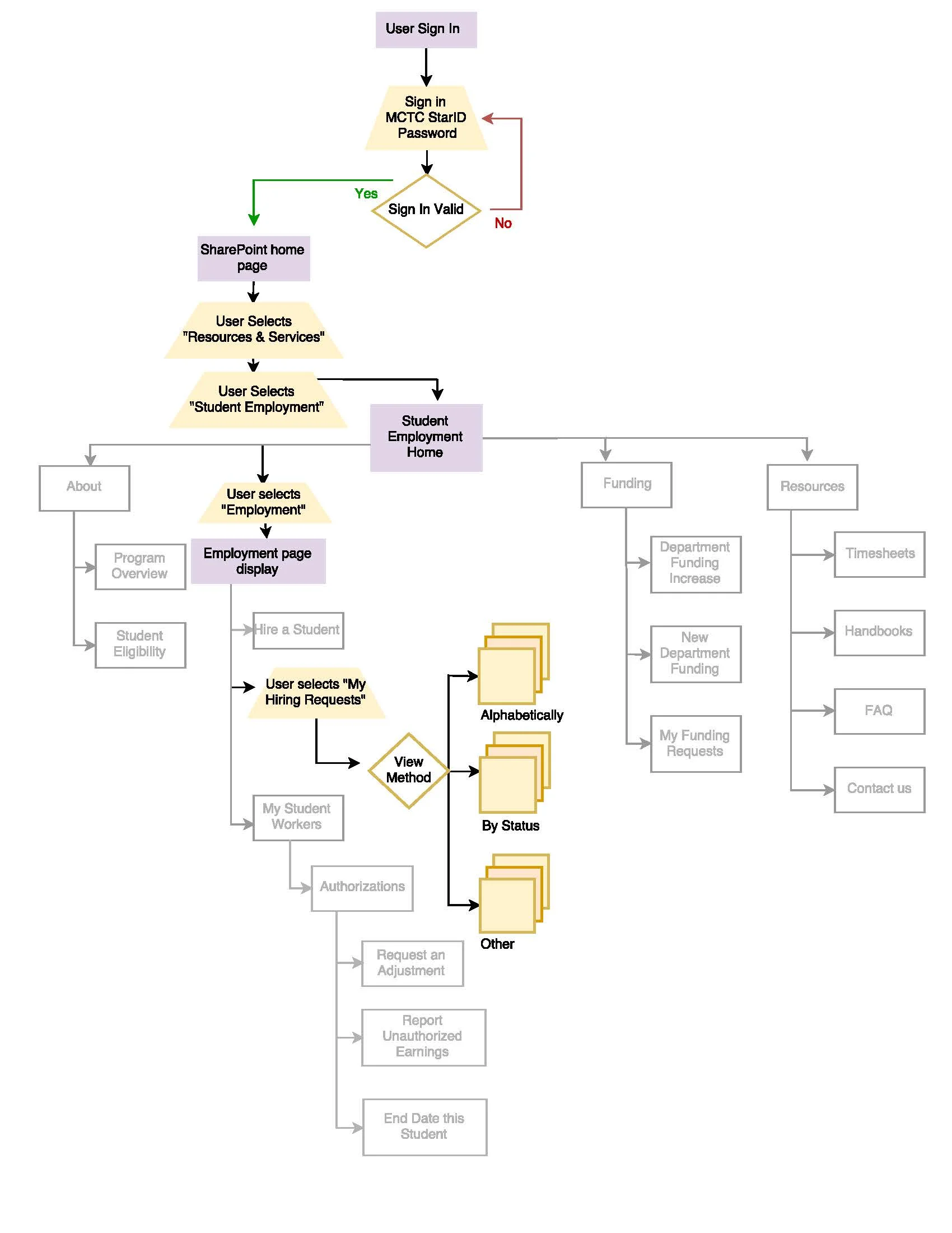
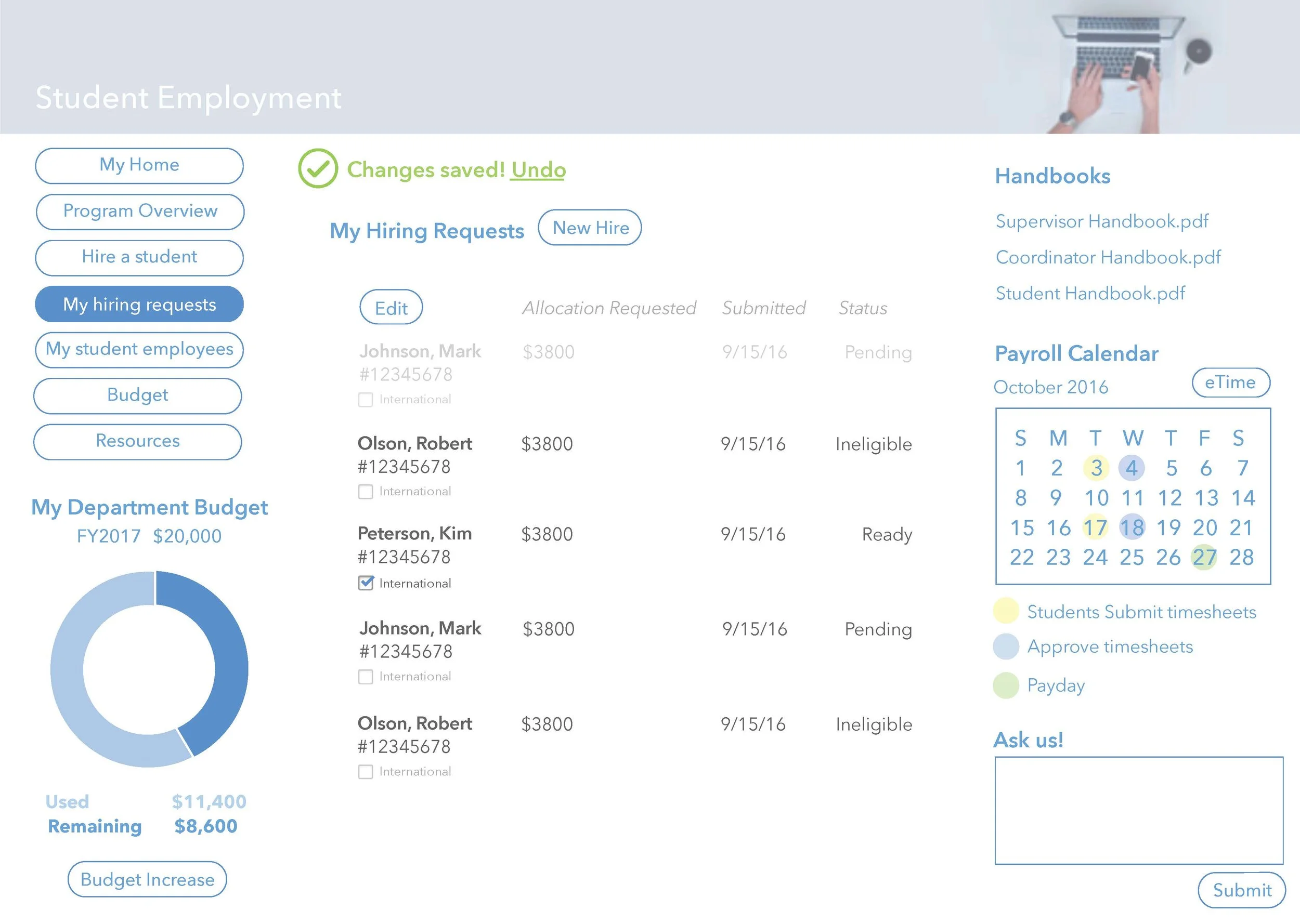
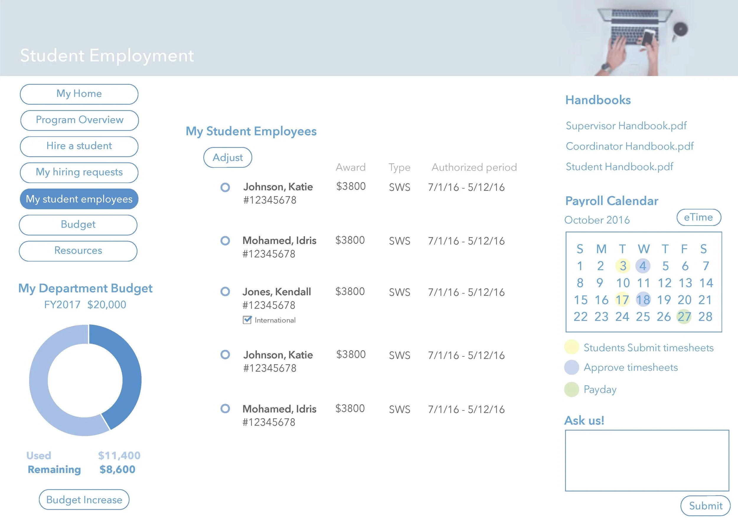
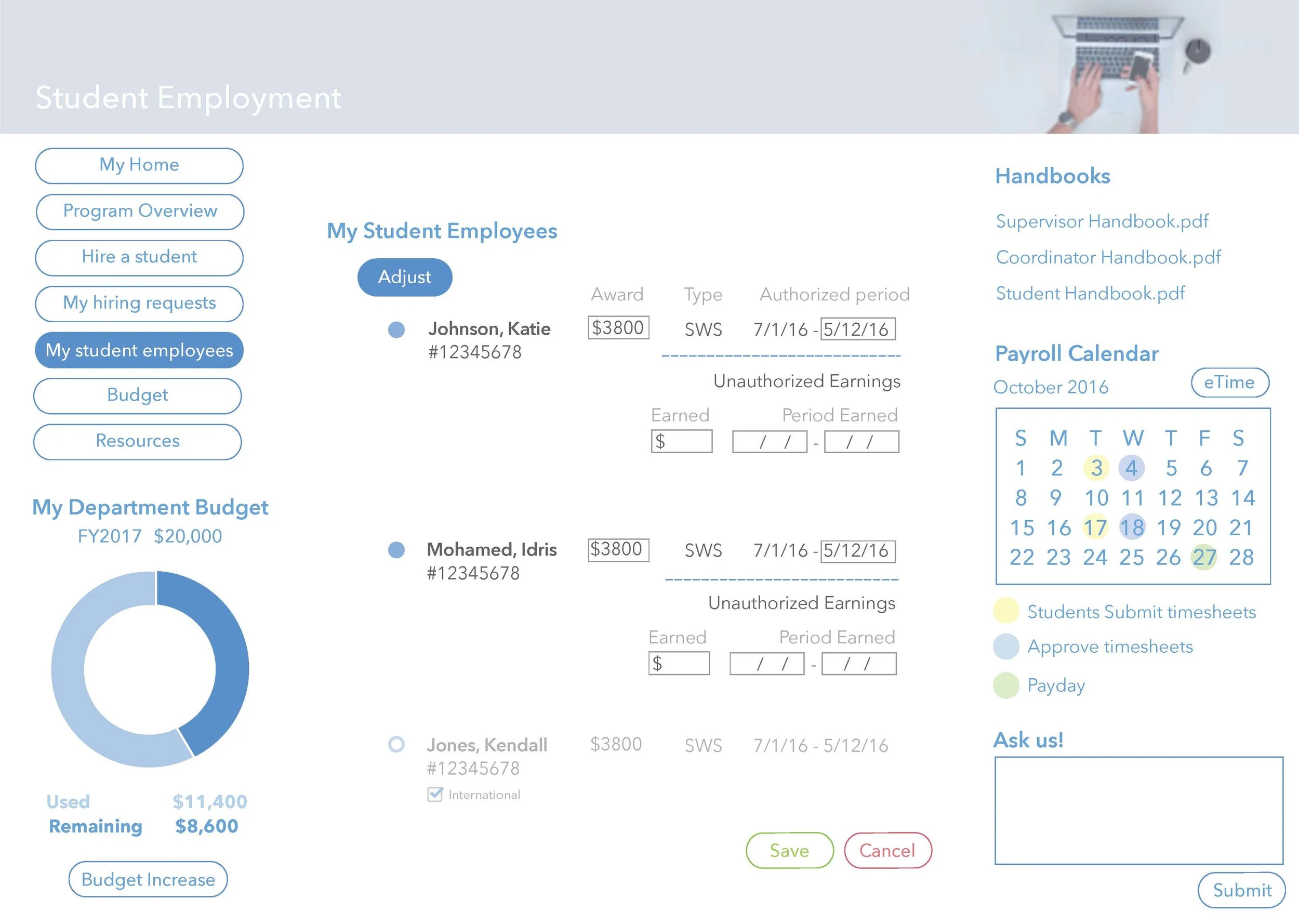
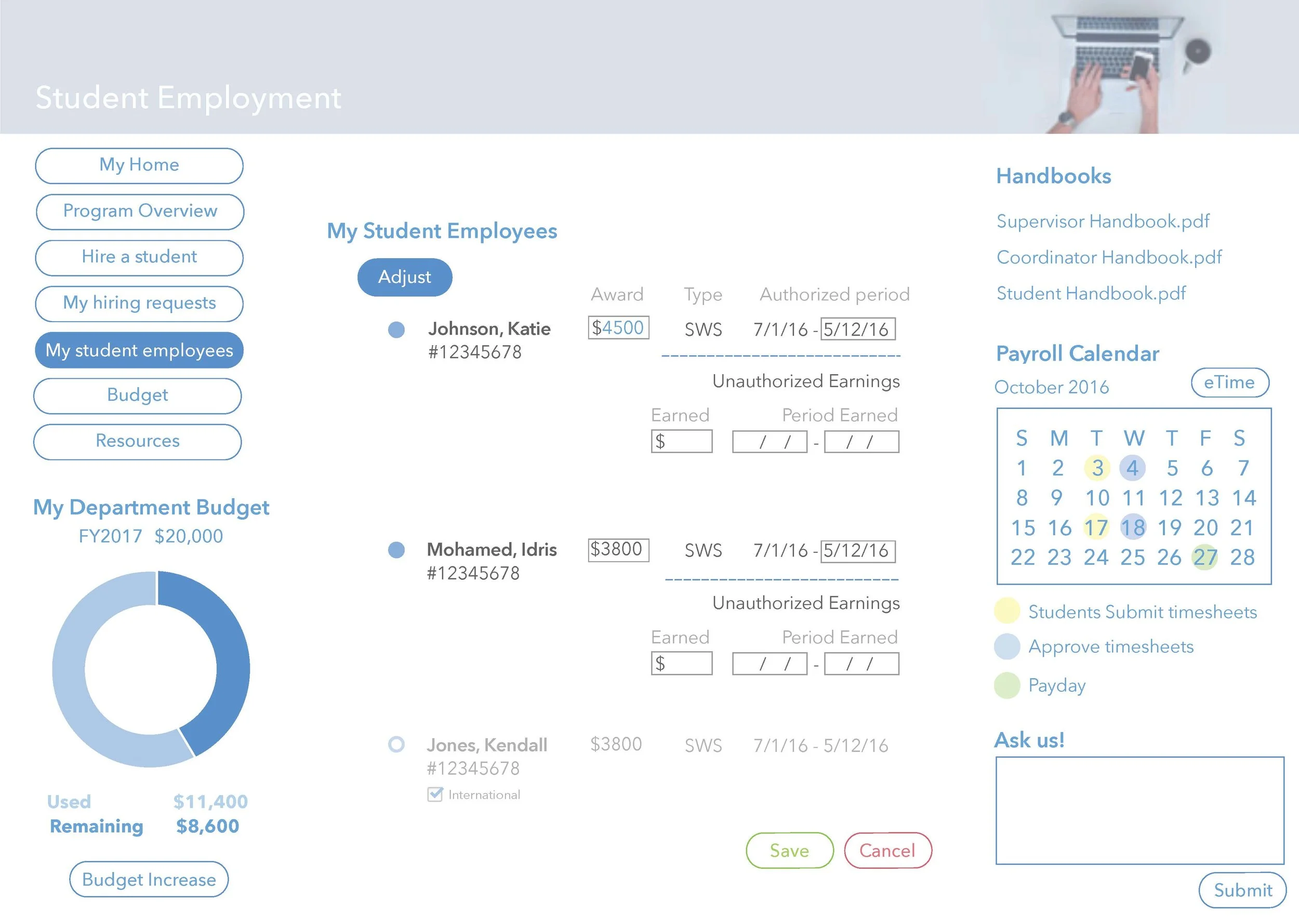
Site maps + user flows
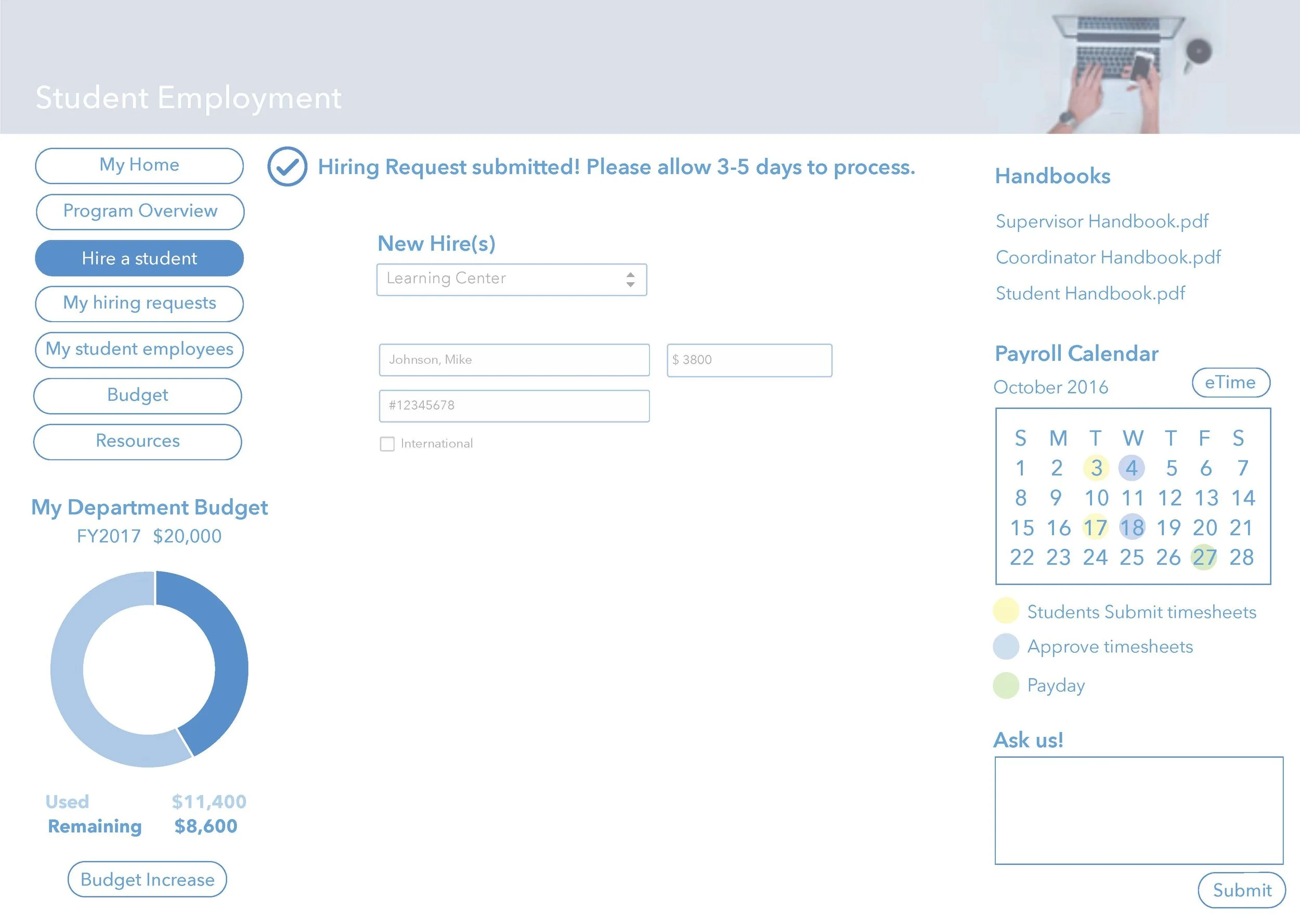
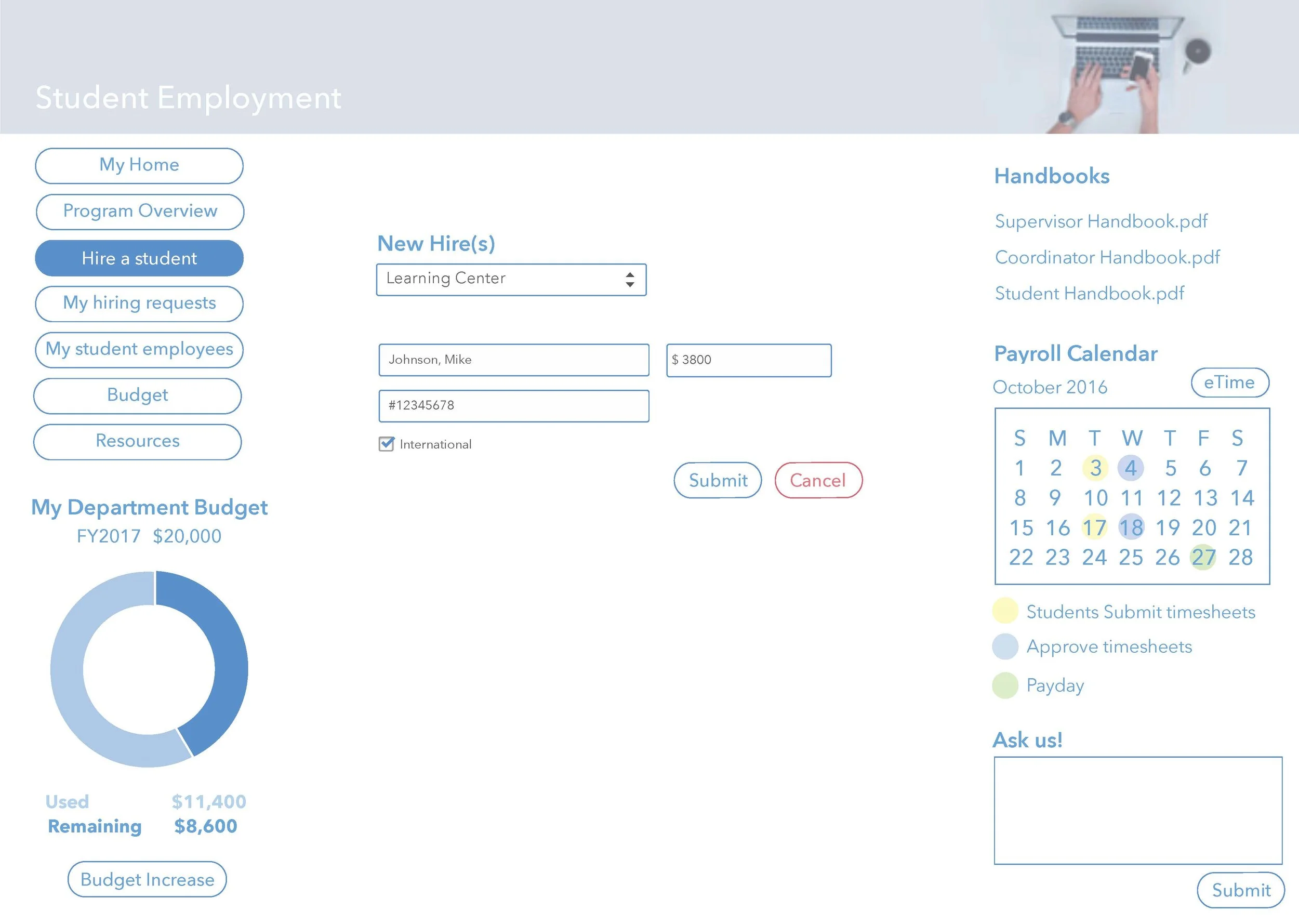
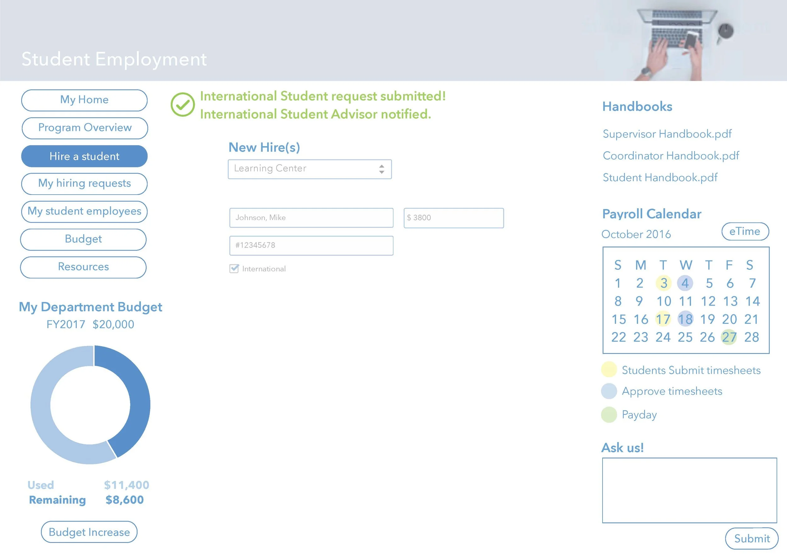
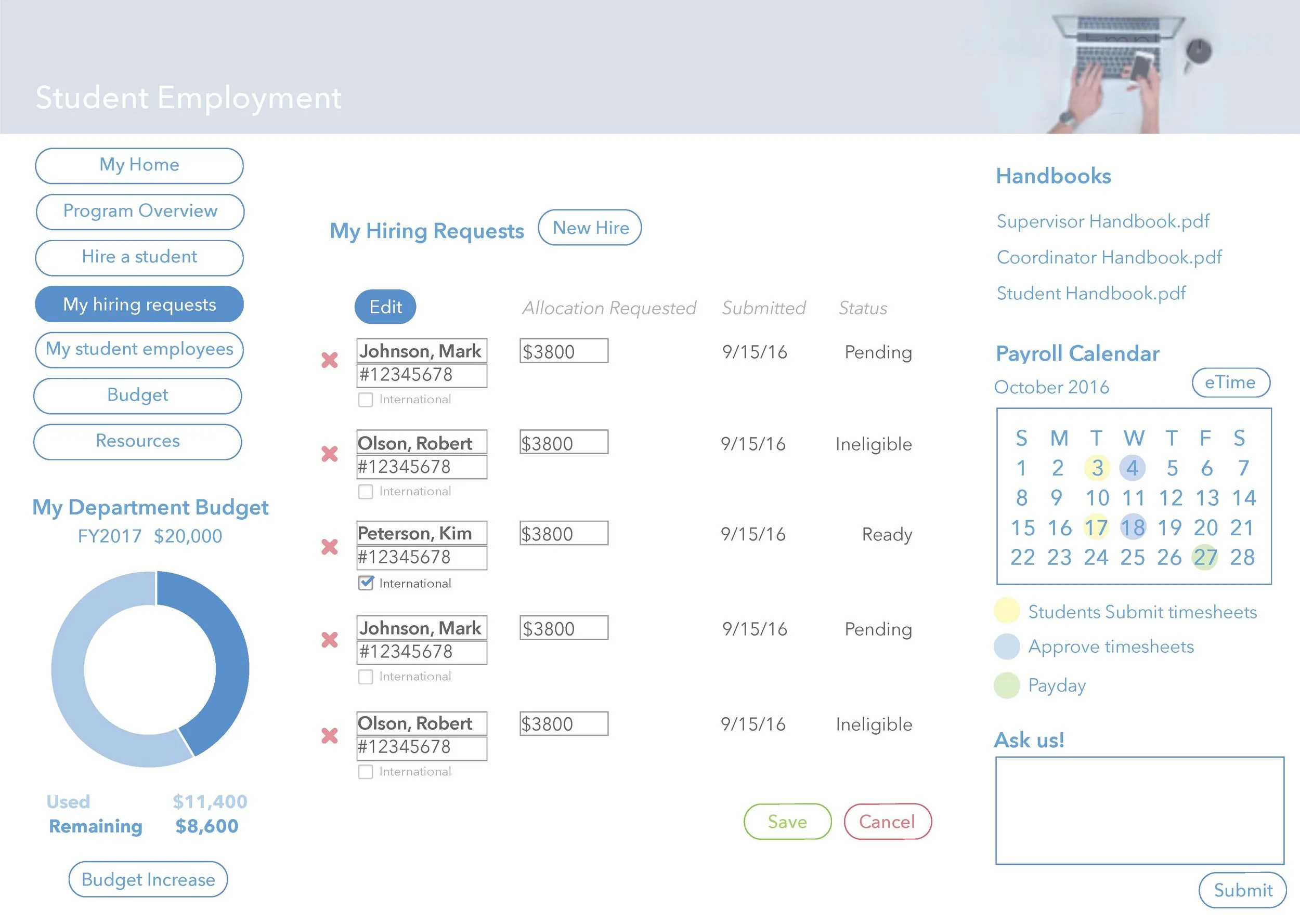
the challenge in creating user flows was to be mindful of the back end processing that takes place. there is a given order attached to hiring a regular student vs hiring an international student. They currently take on complete different routes in processing and this is confusing to users. Supervisors and/or coordinators who would like to hire a student shouldn't have to be given different instructions for international students. Those differences in processing fall onto the individuals actually screening and approving the hiring requests.
to solve this, i included the possibility of a user hiring an international student by having that option available to them at the first step of hiring. the user can simply check the "international student" box which would queue the individuals who review it that additional steps may need to be taken.


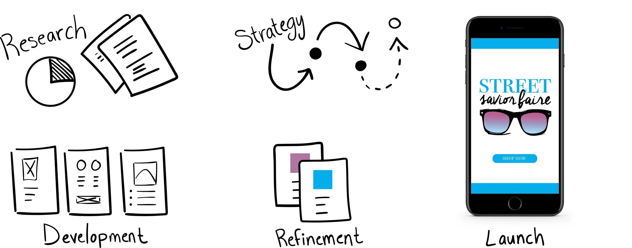
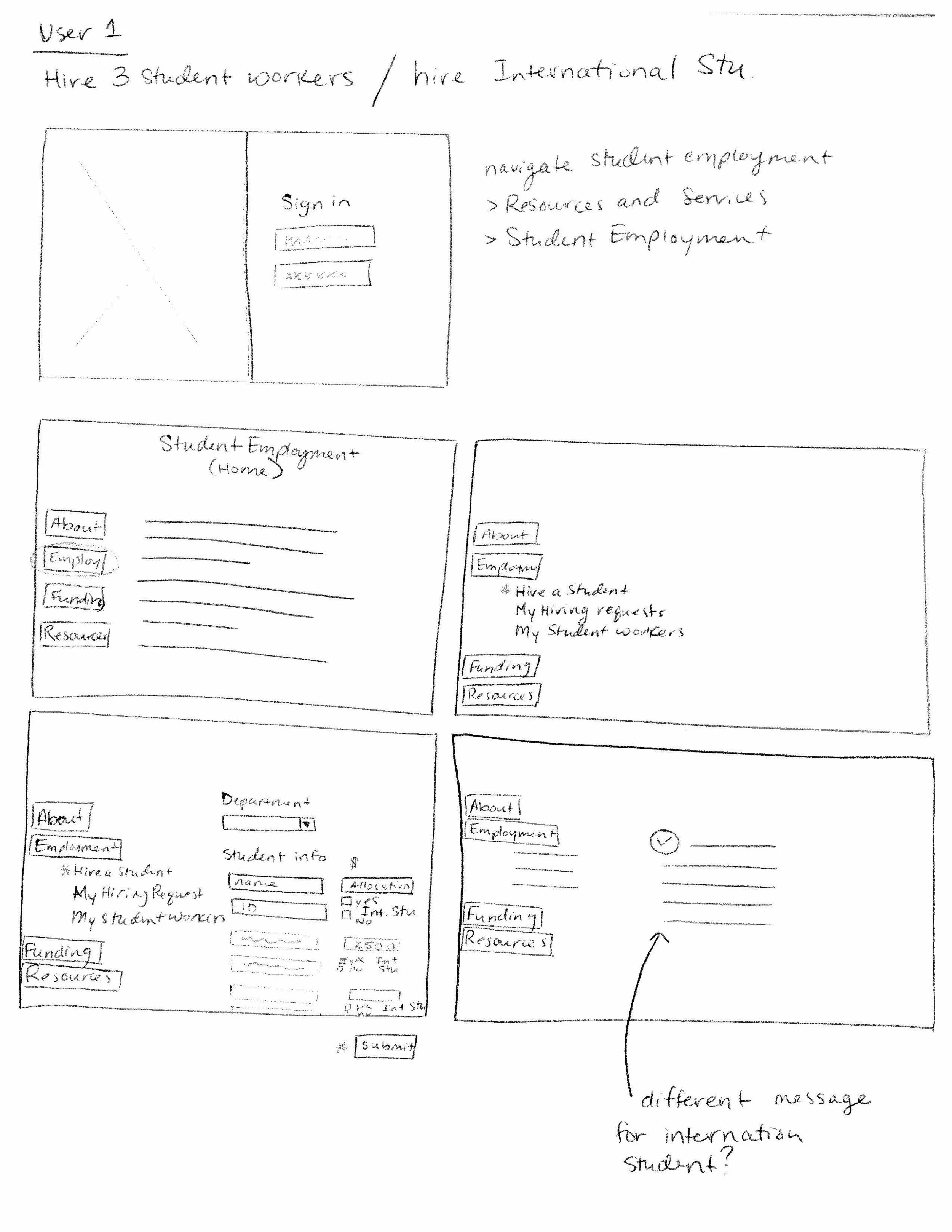
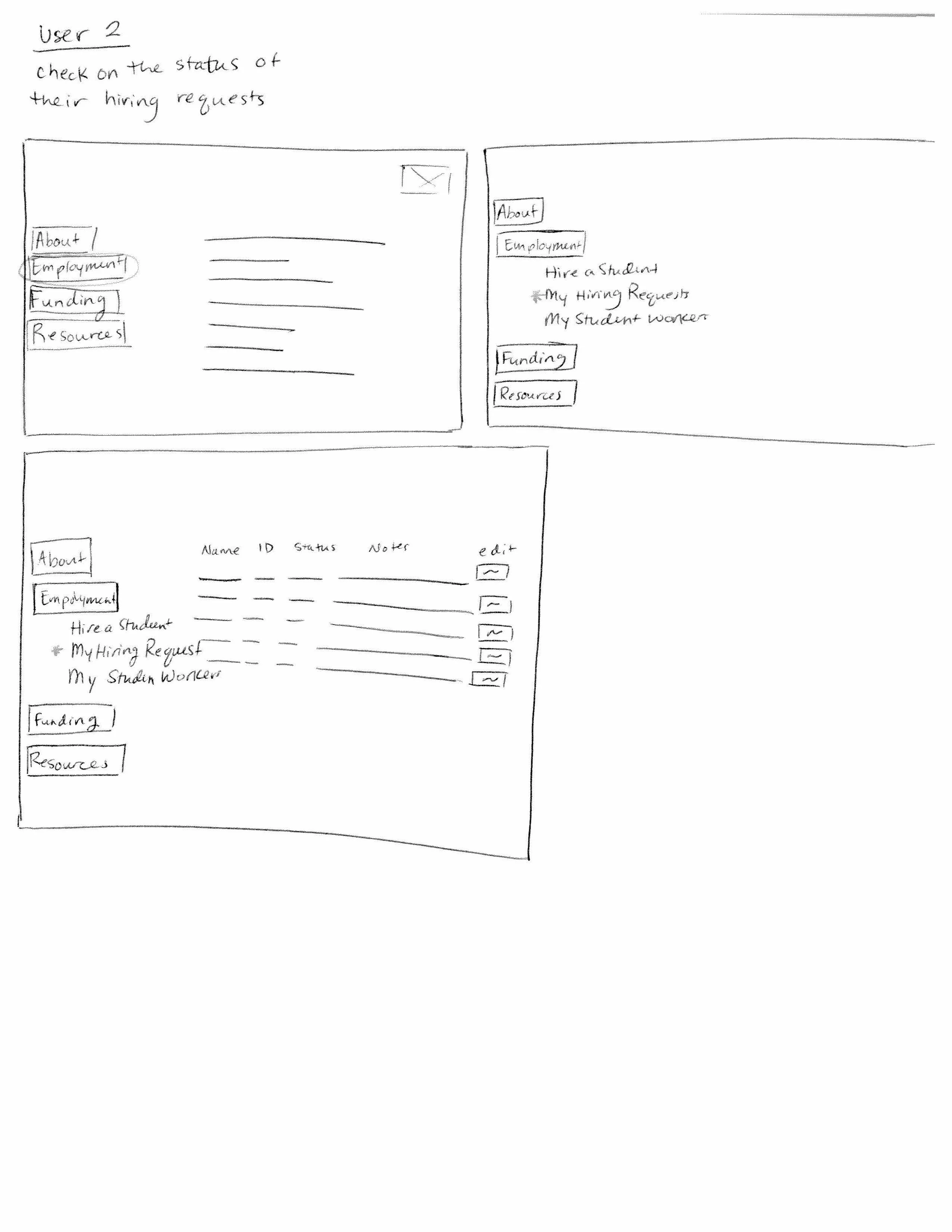
sketches + wireframes

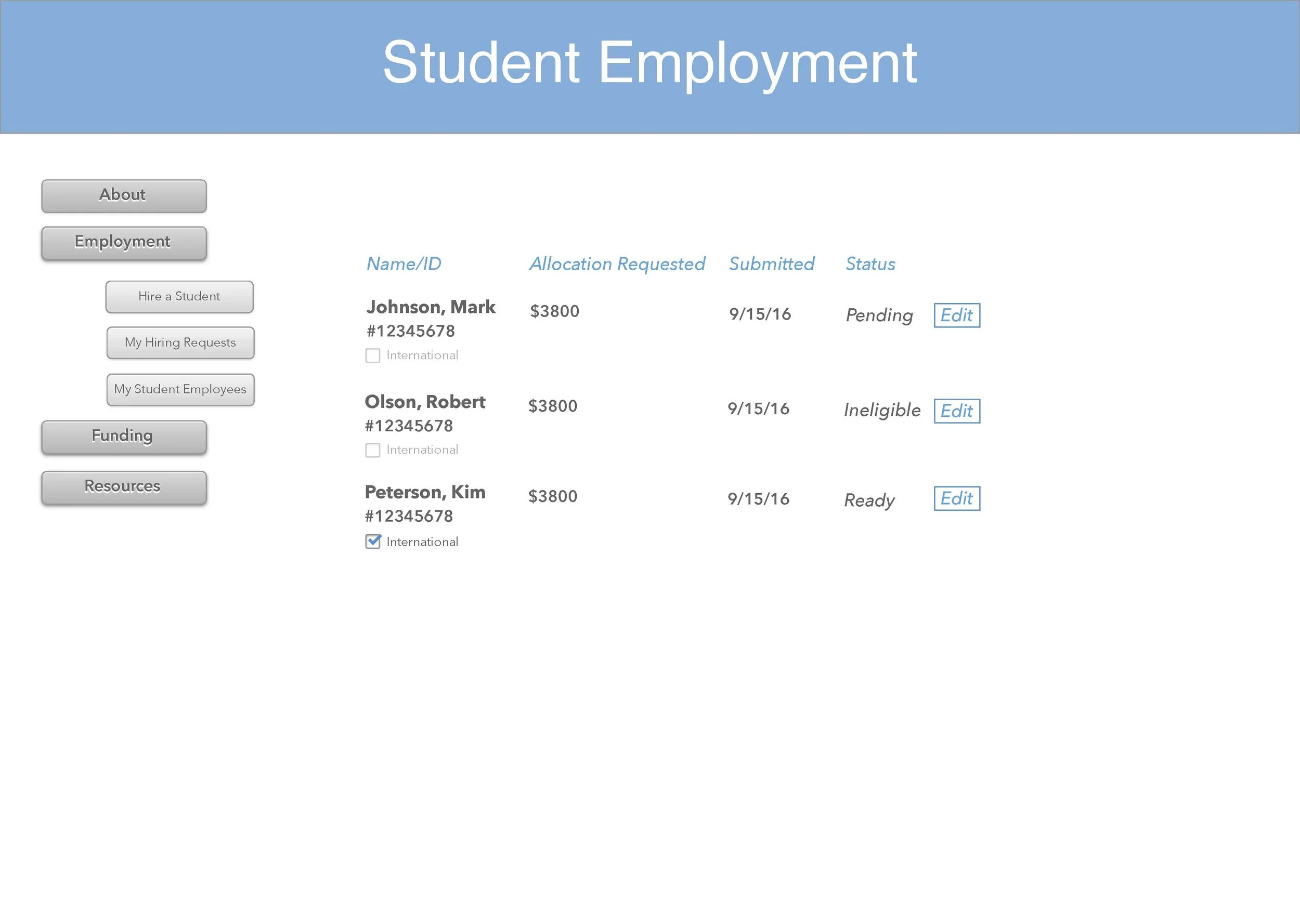
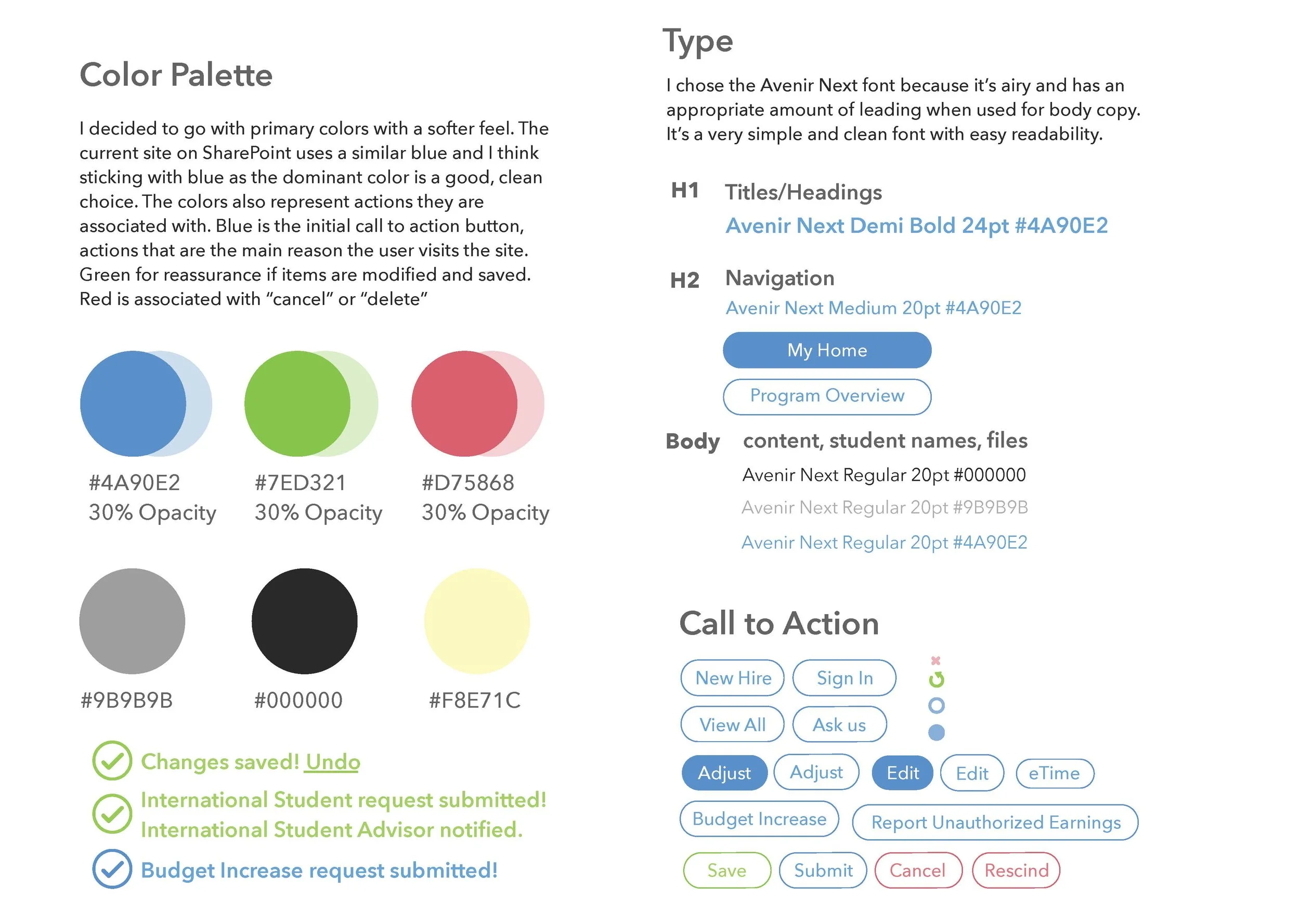
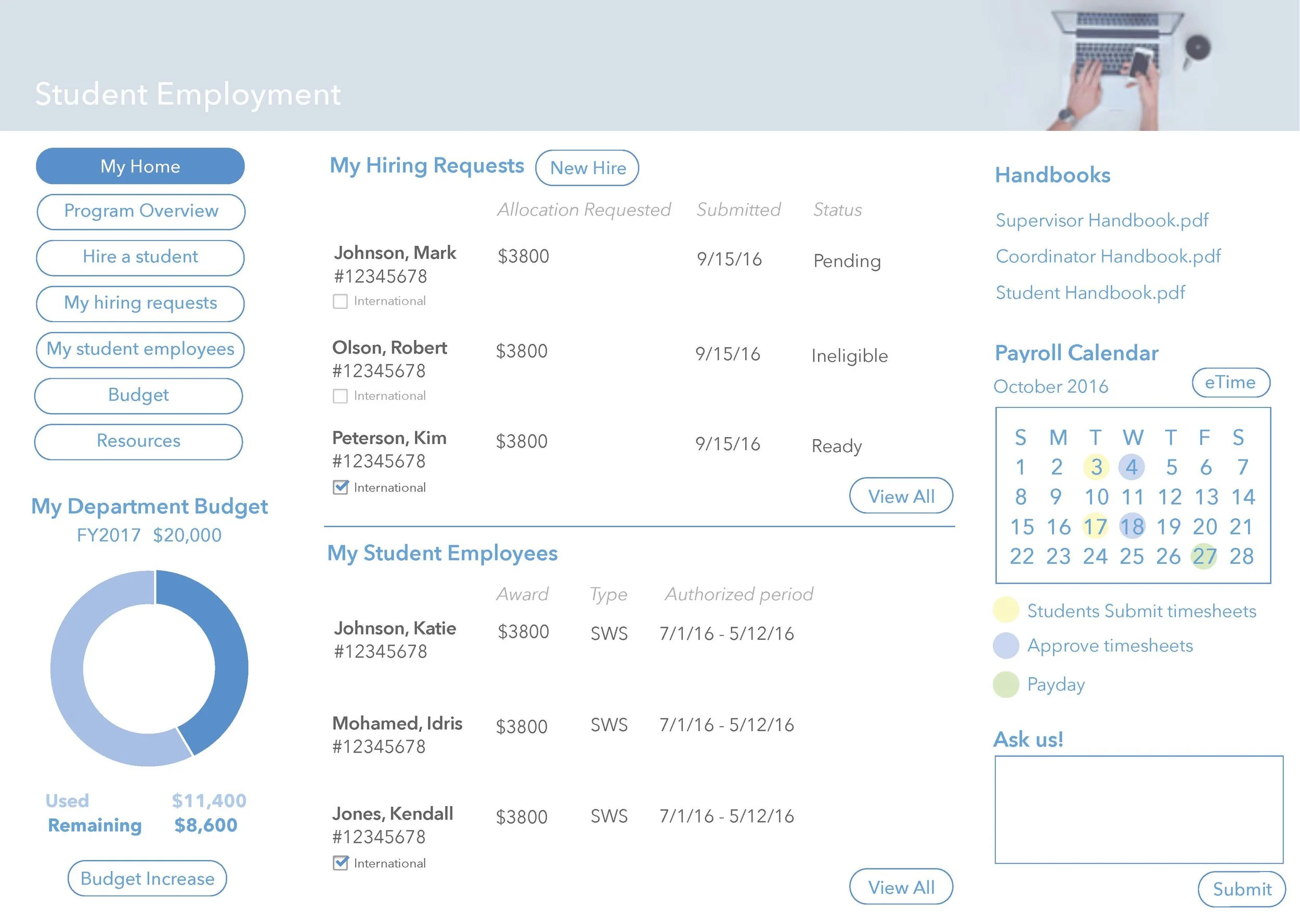
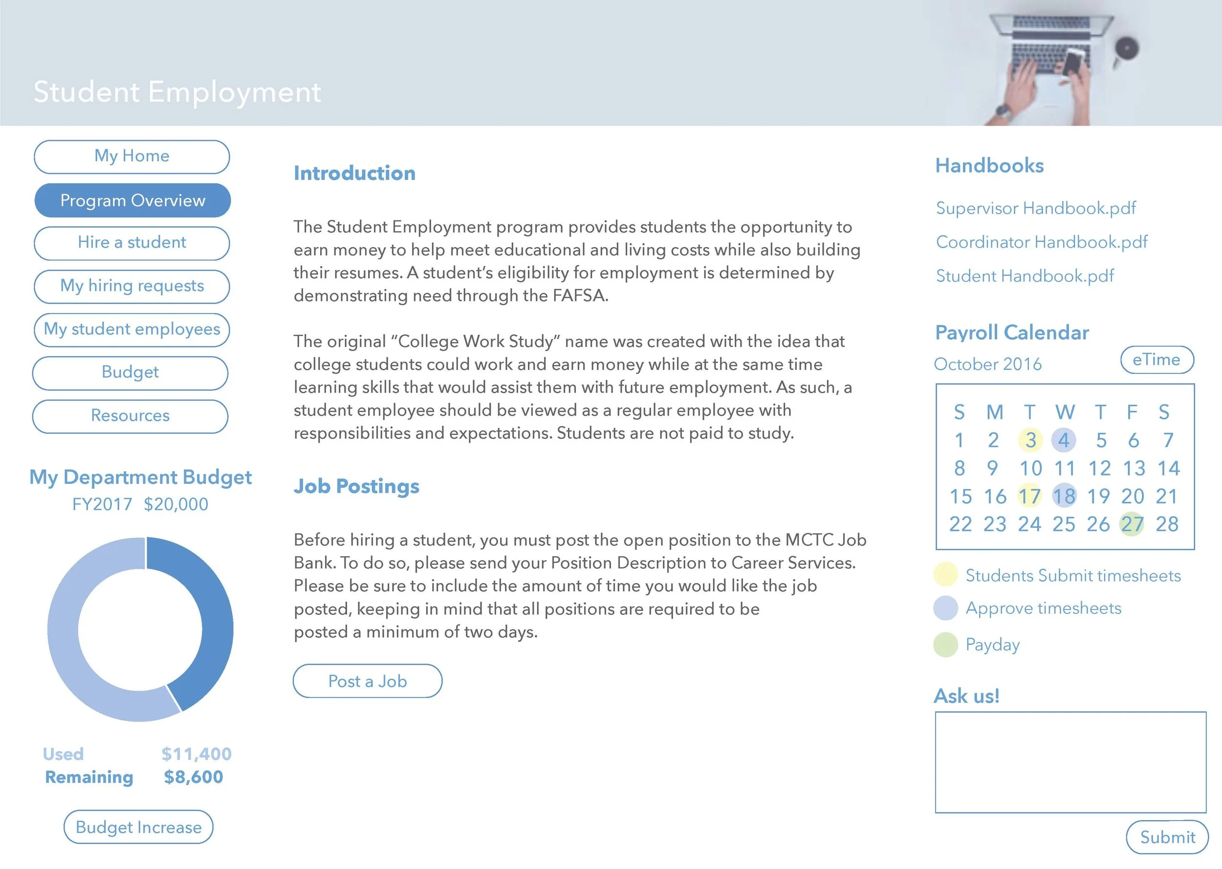
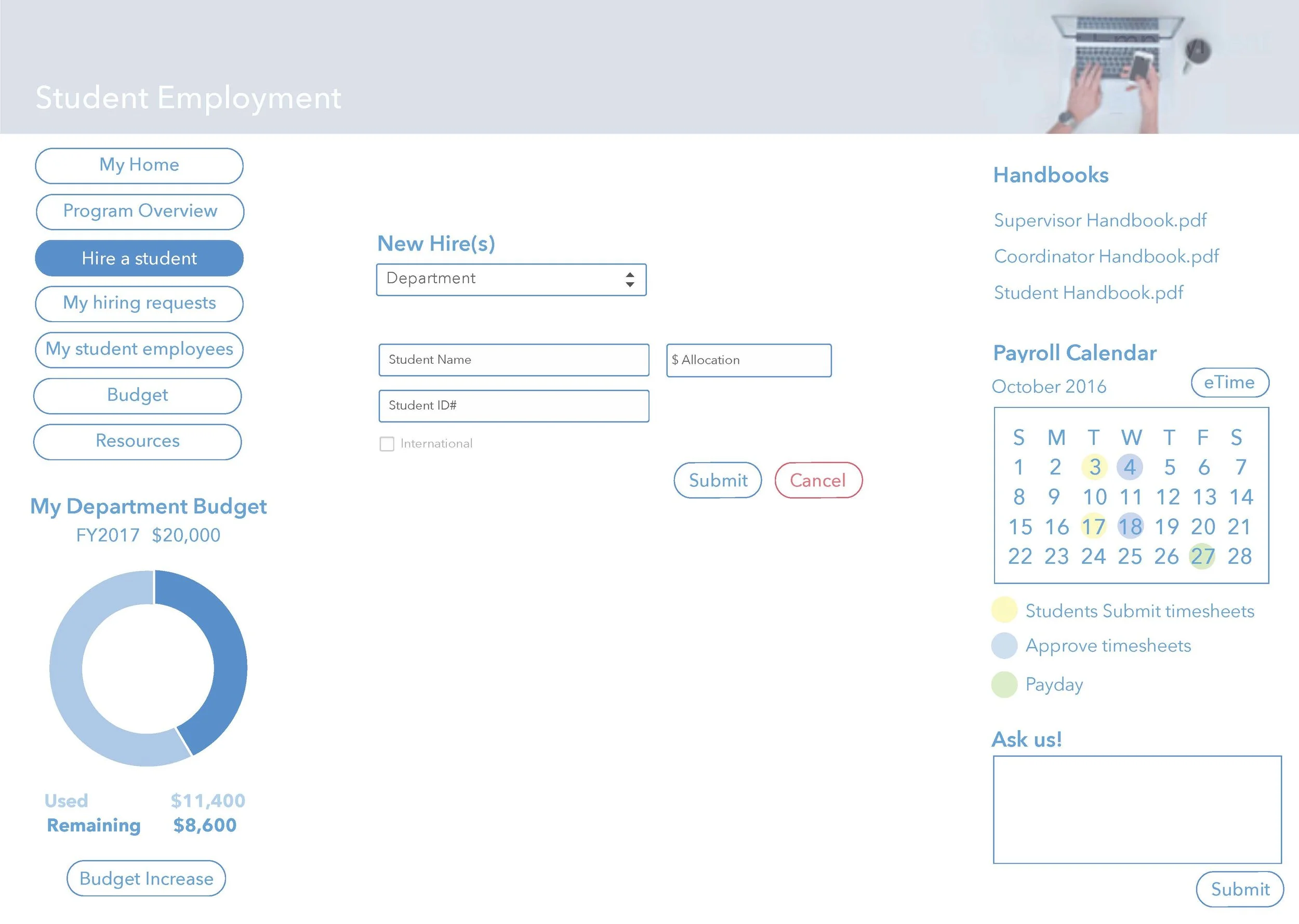
Visual design


research evaluation + user testing
the invision application was used to create the prototype for the test sessions. test sessions took place in the office space of the user.
User A Hires more than 30 students per semester
User B Hires 10-15 students per semester
User C Hires about 1-5 students per semester